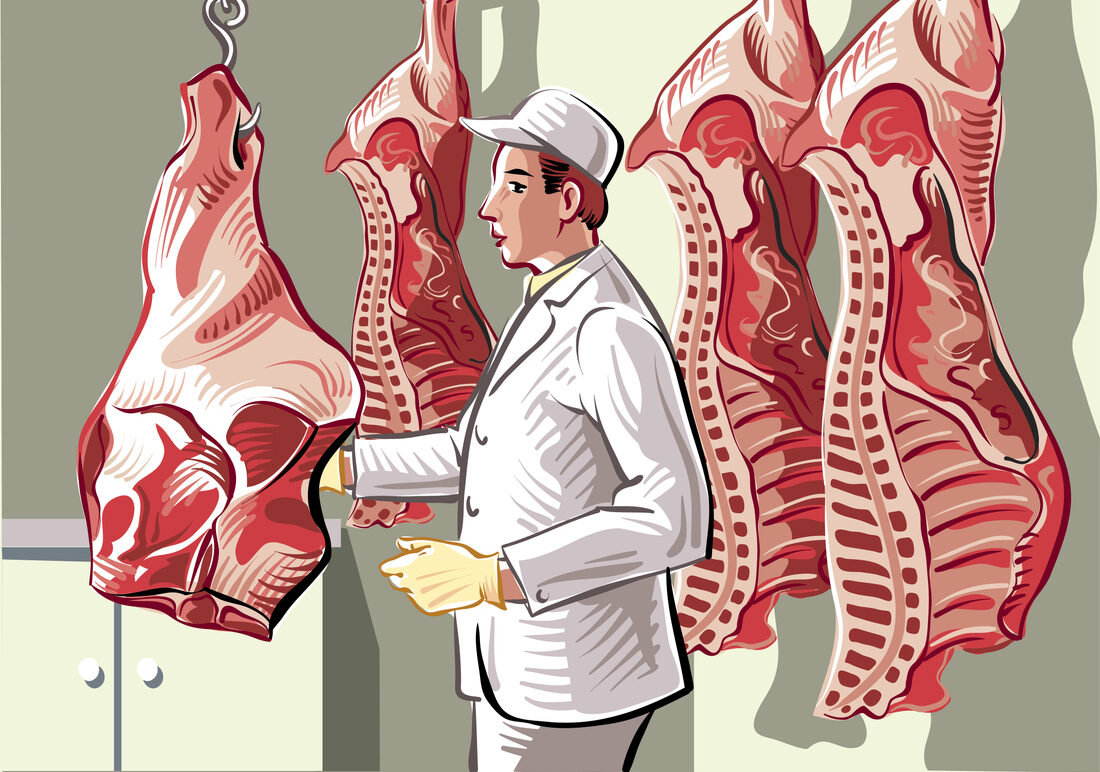
Eating with your eyes: how colour impacts our psychology and relationship with food


We probably aren’t aware that when we go out for a meal, whether in a fine dining restaurant, café or coffee shop, the décor and tableware have been carefully chosen to affect not only the amount and type of food we eat, but also to encourage us to eat hurriedly or leisurely. People have psychological reactions to colours, which influence everything from how long they stay and how much they order.
Subconsciously, colour affects all our senses and colours have an important effect on our appetite and the food we choose – they can make us feel hungry, sad, happy, relaxed or energetic.
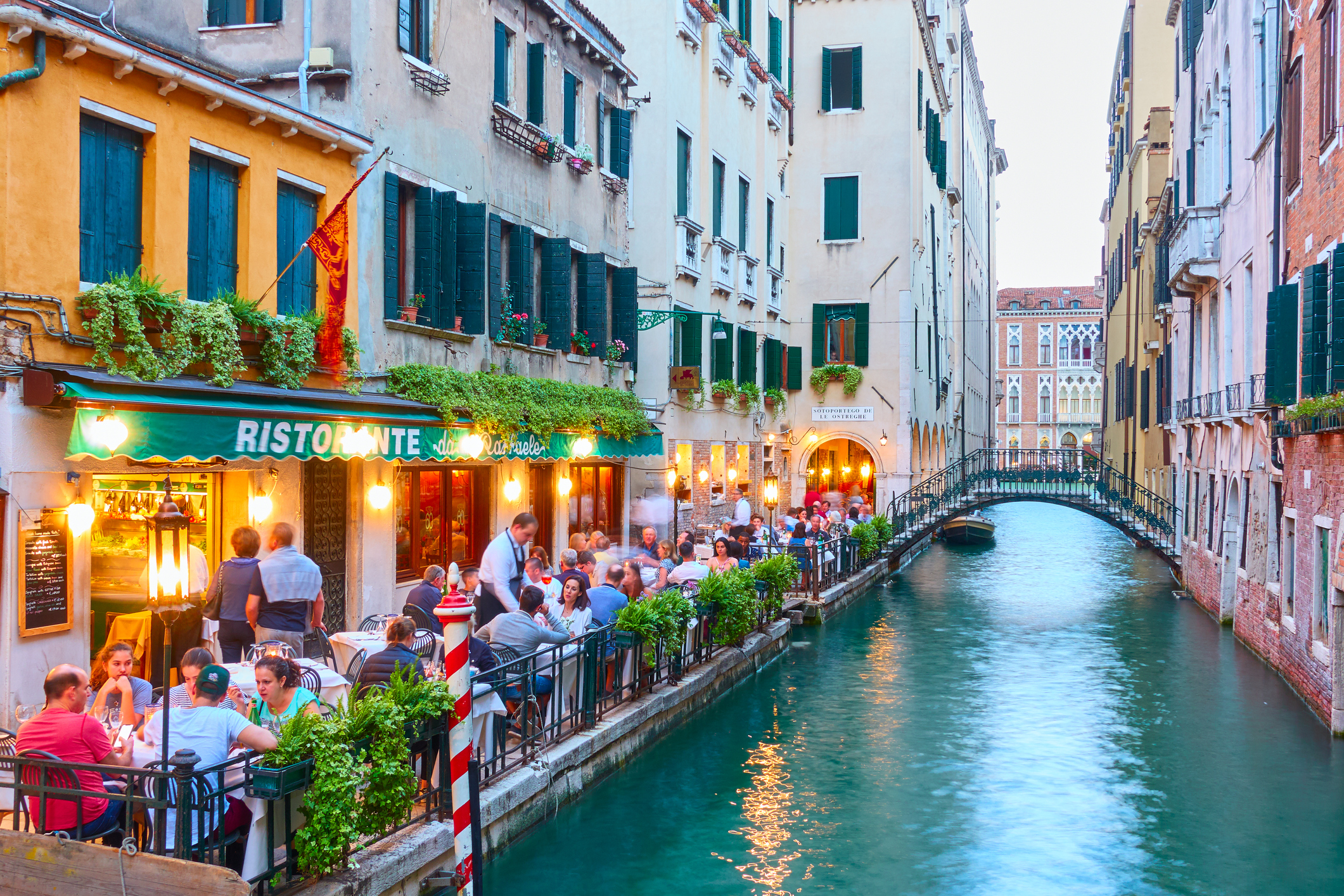
Dining areas are greatly influenced by colour. The choice of colours can affect consumers’ perceptions and choices of foods. There’s no doubt that certain colours are more appetising than others. Bright red for instance, excites and stimulates the appetite and encourages people to eat more; green imparts a feeling of cheerfulness and a relaxing atmosphere; it’s also associated with nature and inspires diners to eat healthy, well-balanced foods and to spend more time at a restaurant; that’s why it’s the most used colour for health-based restaurants.
Orange stimulates the appetite, has an exhilarating effect and indicates informality, which is why some fast-food chains use orange in their restaurants, along with yellow to encourage people to eat quickly and leave; bright yellow stimulates and suggests sunshine, so is particularly appropriate for breakfast; blue, on the other hand, is an appetite suppressant, so serving food on a blue plate is helpful for dieters. This hue is generally associated with relaxation, so coffee shops often have a blue décor and formal restaurants also use it, or soft shades, resulting in longer stays.
It’s not a good idea to serve white and beige foods on the same colour plates as the food appears bland and boring. Research has shown that diners are less satisfied and inclined to overeat. But serving contrasting colours on white plates , such as a strawberry dessert, makes it taste sweeter and more intense.
Award winning, Canadian based graphic designer, Ashley Anastasia Howell of Avid Creative, specialises in advising the food and beverage industry on menu psychology, branding and design.
“I am so fascinated by this topic because it is interesting to understand our subconscious and how we react by the colours we see. “, says Howell. “Most people, including myself, are unaware of how much a colour or ‘chromatics’ can influence reaction and trigger our appetites; red and green marketing induces larger and healthier appetites. The popularity of fast-casual restaurants suggests the targeting of a new generation who really focuses on quality food, all while having fast food service.
“So, does colour really matter? Greens and blue are more targeted to healthier and fresher foods. So the perception is in line with the style of the restaurant. Whereas, red can be a little more indulgent and impulsive, which may not have the right message when you’re targeting a healthy and ingredient conscious market. Colour blindness is a good example of how colour can affect the perception of food. If you or I were colour blind and do not see food in the full colour spectrum, this may result in the food looking less appealing. “
The last few years have seen the emergence of the ‘Dine-in-the-dark’ or ‘Dans le noir’ restaurants where diners eat and drink in total darkness. Because visual cues play a critical role in our perception of flavour and in the control of our appetite, it transpires that diners can find it difficult to distinguish between flavours in the absence of visual signals.
Chef and food writer, Kevin Ashton has cooked in 5 star hotels around the world He’s also cooked for Her Majesty Queen Elizabeth II, US President George H. W. Bush and Hollywood celebrities. “Many chefs and restaurateurs are only just beginning to understand the importance of colour and the impact it has on their customers.”, he says. “Matching the colour to the aim of the restaurant can be very useful. There is much more research to be done, not just on the colour schemes, but on the vista a restaurant may have. Does a sea view looking out onto the harbour make customers believe all the seafood must be brought in from local fishermen? And not just the vista; I can say from my own experience that the smell of fresh sea air can increase appetite. Tuning into customers’ senses is an intriguing subject”.
The same rules apply to food packaging, where colour influences our purchasing decisions and has a great impact on the choice of foods we decide to buy. Red, a warm colour which dominates the food marketing industry attracts attention. Warm colours complement each other, hence there’s plenty of red-yellow or red-orange food branding.
Health and organic foods are likely to use green as the major colour, as it suggests goodness, freshness and wellbeing. Purple, used by a long established much loved English chocolate brand signifies luxury and quality.
When it comes to drinks, their colour affects how sweet or bitter they taste. Adding different food colours, but not changing the flavouring, changes the taste in distinct ways. For example: for orange juice, the brighter the orange colour, the sweeter we think it is. Adding dark red colouring makes a strawberry drink taste sweeter than a lighter red form of the same drink; while a light green coloured drink seems to taste sweeter than a dark green one.
We associate different foods with particular colours. When a leading brand of tomato ketchup introduced a green version, it wasn’t a success, as consumers thought it didn’t taste like the usual red ketchup even though the formula was identical. Also unsuccessful was the launch of a colourless cola by a major drinks company – this was attributed to the fact that people associate different colours with different tastes and consumers reported that it tasted like lemon lime soda, yet neither of these flavours were included in the ingredients!
The last words must go to Marcus Gavius Apicius the 1st Century Roman gourmand, who reputedly conceived the phrase ‘We eat first with our eyes’. A growing body of scientific evidence confirms just how true this is.